
White vs Black Swimwear: Which Is Actually Harder to Make
Byoyoyi.ai— written with AI-assisted research, reviewed and fact-checked in-house.
Pantone named Cloud Dancer — a soft, airy off-white — as a defining color direction for 2026, and swim and beachwear trend reports have already picked it up as one of the season's strongest palettes. Most coverage of this stops at the aesthetic: pair it with sand, terracotta, or two-tone contrast cuts. What it doesn't cover is the real production question a brand should ask before committing a collection to it — and the answer contains a genuine surprise. Everyone assumes white is the hard color to manufacture. Based on what we actually see on the production floor, black is the harder one — just for a completely different, less obvious reason.
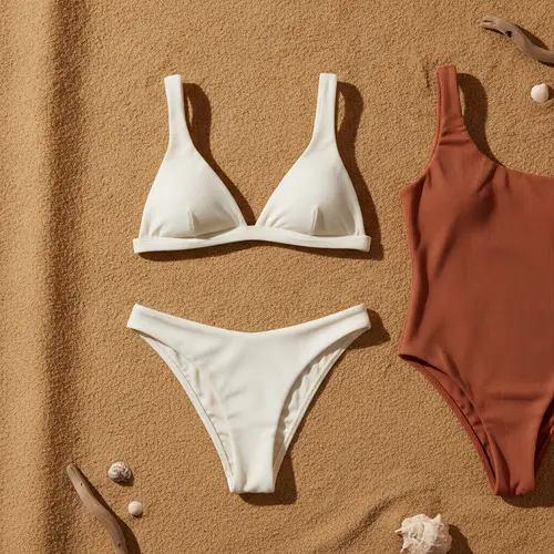
White: The Problem Isn't What Most People Think
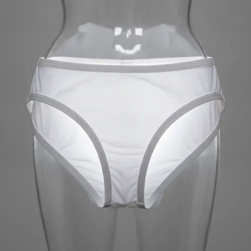
White and off-white swimwear does have real, well-known challenges — but not always the ones buyers expect.
Sheerness when wet is a problem we've never fully solved from the fabric side. No matter how the base fabric is engineered, white and pale swim fabric tends toward some degree of see-through once saturated with water. We haven't found a fabric-level fix for this. The practical solution we actually use is architectural, not chemical: building in a double-layer internal brief (a built-in four-corner lining) rather than relying on the outer fabric alone to stay opaque.
The complaint we get most often isn't fading — it's contamination. This is the real reason we're cautious about taking on white swimwear orders at all: white fabric shows every mark left behind by the production process itself. Metal presser feet and machine components leave faint residue and rust marks that are invisible on colored fabric but show clearly on white. White fabric also physically attracts and holds onto lint from other colors moving through the same production environment — a stray thread of black fiber lint can visibly migrate into white fabric during cutting or sewing. This isn't a fabric defect or a dyeing issue; it's a production-environment risk that's specific to light colors, and it's rarely mentioned in generic "how to source white swimwear" content because it only becomes obvious once you've actually run white fabric through a real cutting and sewing floor.
Lining creates its own visibility trade-off. For white and pale designs, the lining has to closely match the outer fabric color — which usually means a double-layer construction. But that raises a separate cosmetic problem: a removable sponge cup insert shows through visibly as a distinct shape under light-colored fabric, which most brands don't want. We generally handle this one of two ways: a three-layer bound-edge construction that minimizes how much the padding shape telegraphs through the outer fabric, or skipping the padding insert altogether and letting the end customer wear their own adhesive nipple covers if they want that coverage.
Yellowing is a real risk, though not one we've had to solve directly ourselves.Chlorine attacks the molecular bonds in spandex/elastane directly, and that degradation shows up as yellowing that's far more visible on white and pale colors than on anything saturated. The fabric-side fix, per the broader textile engineering literature, isn't a finishing trick applied after the fact — it's choosing the right elastane at the fiber stage. Branded elastanes engineered specifically for chlorine and UV resistance carry meaningfully better resistance to this kind of yellowing than generic spandex, and manufacturers commonly add UV absorbers and light stabilizers into the fiber itself during production specifically to slow this kind of discoloration. If yellowing resistance matters for a white-heavy collection, that's a conversation to have with your fabric supplier at the fiber-selection stage, not something to try to fix after the fact.
Black: The Harder Color, For a Reason Almost No One Explains
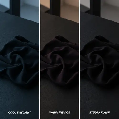
Here's the real surprise: in our experience, black — not white — is the color most likely to come back inconsistent. Black swimwear fabric can render with a blue undertone, a purple undertone, a deep-red undertone, or a true neutral jet black, sometimes across what's supposed to be the same color order. This isn't random, and it isn't a quality failure in the usual sense — it comes down to how "black" actually gets made.
True black is rarely a single dye — it's a mixture. Achieving a rich, deep black typically requires combining multiple dye components (commonly cyan, magenta, and yellow disperse dyes, or an equivalent combination) rather than applying one uniform black colorant. The problem is that these component dyes don't behave in a straight line as concentration changes — some disperse dyes shift hue as they're concentrated, moving from one color family toward another as more dye is applied. A "black" formulated from multiple shifting components is inherently more sensitive to small variations in dye ratio and process conditions than a color built from a single, stable colorant — which is exactly why undertone drift toward blue, purple, or red is a real and recurring issue with black specifically, not a coincidence tied to any one supplier.
On top of that, there's a phenomenon called metamerism — two colors that appear to match under one light source can look noticeably different under another, because their underlying spectral reflectance is different even when the visual result looks the same in a given light. This is a well-documented textile color-matching challenge, not something specific to any one factory's process. In practice, it means two black fabric batches can be checked and approved as matching under a factory's standard daylight lamp, then appear to have a visible undertone difference once photographed under different lighting or viewed by the end customer under different conditions.
What This Means If You're Sourcing Either Color
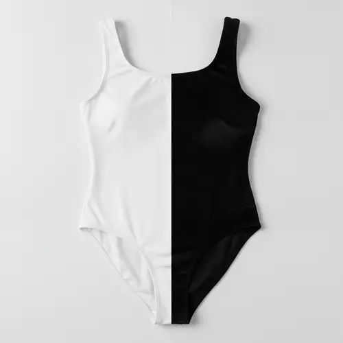
For white and pale designs: ask your manufacturer directly how they handle production-floor contamination risk for light fabric, and confirm the lining/padding construction approach up front — this is a design decision, not just a manufacturing detail, and it affects the finished silhouette.
For black designs, especially ordering across multiple production runs: don't rely on a single lighting check. If undertone consistency matters — for a multi-piece set, or a reorder that has to match an earlier batch — ask to see the fabric compared under more than one light source before approving a bulk run, since a match under one light doesn't guarantee a match under another.
Both of these are the kind of real production risk that gets left out of seasonal color-trend coverage entirely, because trend reports are written from a design perspective, not a manufacturing one. This is the same bust support and cup construction territory where what looks like a simple design choice turns out to have a real construction trade-off behind it — color is no different.
White and black aren't the only colors carrying real, under-discussed production trade-offs — high-saturation neon and true fluorescent tones for SS2027 have their own separate set of chemistry and compliance constraints, which we break down in our look at what's actually achievable in neon swimwear for the coming season.
FAQ
Q: Is white swimwear more likely to fade than other colors?
A: Fading isn't actually the most common complaint we see with white — production-floor contamination (residue marks, lint migration from other colors) comes up more often. Yellowing from chlorine and UV exposure is a real long-term risk, though, and it's more visible on white than on saturated colors. See our dedicated breakdown of colorfastness and fading for more on that specific mechanism.
Q: Why does black swimwear sometimes look slightly blue or purple instead of true black?
A: True black is typically formulated from a mixture of multiple dye components rather than a single colorant, and those components can shift hue as their concentration changes. Small variations in dye ratio or process conditions can therefore produce a visible undertone — this is a known characteristic of how black dyeing works, not a defect specific to one supplier.
Q: How can I check whether a black fabric sample will match my bulk order?
A: Compare the sample and a bulk swatch under more than one light source before approving — a match under a factory's standard lighting doesn't guarantee a match under natural daylight or a different light source, a phenomenon known as metamerism in textile color matching.
Q: Does a built-in lining solve the sheerness problem with white swimwear?
A: It's the most reliable fix we've found — a double-layer internal brief addresses sheerness effectively, though it introduces its own trade-off: a removable padding insert can show through as a visible shape under light fabric, which needs a specific construction approach (like a three-layer bound edge) or the padding needs to be left out.
Q: Should I avoid white or off-white swimwear for a new collection?
A: Not necessarily — it's a real, currently trending color direction. The point is knowing the real production trade-offs (contamination risk, lining/padding visibility, yellowing over time) before committing, the same way you'd want to know black's undertone-consistency risk before ordering a black-heavy line across multiple production runs.
Planning a white, off-white, or black-heavy collection and want to know what the real production trade-offs look like before you commit? Tell us the design — we'll walk you through what actually happens on the floor with that color.